That was fun. Back to work.
 Tuesday, December 28, 2010 at 11:12AM
 Ok the faux news flash was fun but lets get back to work. Twice in the last week the inferiority of some embossed texture papers has come up. Brother bought me some MicroMark bricks for Xmas. Well besides the laugh, I was astonished to see just how bad they looked. The embossing is little more then some random bumpyness. Very uncrisp. I do think the paper would have looked better without it. It was distracting and made the texture look undefined. The printed image itself was booring and unrealistic. Then today, I had to respond to a post at the MRR forums. A gent there is scratch building a very nice grainery. I made a comment earlier in the thread about how much i liked it. I have been watching and thinking how much better it would look using our textures but kept my tongue silent.
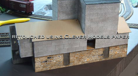
Just yesterday he covered the foundation in MicroMark embossed stone paper. I was unimpressed and so were lots of others. The negative coments about paper were flying. well I couldn’t sit still for that, so I did a bit of retouching on the posted pic. Obviousty it’s real low resolution, but I tried to make the retouched pic as fair a representation as possible.
Here are the results.
MicroMark’s. Notice that the patern repeats 4X across the wall.

Our’s. Notice no obvious repitition of pattern. (It does repeat, just not obviously.)
Next post, I’ll talk about embossing and how you can do it yourself. (if you must)
 Dave |
  2 Comments |


Reader Comments (2)
Then flip the paper over and with a bigger burnisher i can push out some stones using the marks i made on the front as a guide.
I'll have to copy this to the blog!
Thom